I trust 2012 has treated you with the respect you deserve.
So far, at least.
I thought I'd start the year by writing a process blog post on the very last illustration I produced in 2011. (A year we've already forgotten.) I've tried to keep it kind of brief - I occasionally lecture on this sort of stuff and so I started to slip into that mode a bit and had to reign myself in. Next time I do one of these I'll try and snatch more informative mid-process screengrabs (most of those below were taken at the end).
The Movie Dredd Xmas Drawing
Pete Wells, who runs the fabulous 2000AD Uncovered blog, emailed and asked me if I fancied contributing to the 'pros' section of the 2000AD Advent Calendar. I told him I'd love to - in fact it'd be an honour - and then put some thought into what I would draw. I'm ashamed to admit I had a bit of artist's block...
Then Pete told me who else was going to be in the 'pro' section of the calendar.
Other than me, it was more or less every genius artist currently working on the comic.
So now that the pressure was off - I couldn't hope to compete with whatever they came up with! - my stupid block cleared and I decided I'd take a stab at drawing Judge Dredd as he's due to appear in the new movie Dredd.
If you do a Google images search for "new movie dredd" you'll see the six or seven photos I had to work from.
I put them all up on screen and tried to piece together the movie uniform. This was actually loads of fun and reminded me of doing exactly the same thing with old comics and superhero costumes when I was about five.
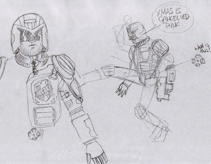
I settled on the first pose I came up with, because it felt a bit like something either Mike McMahon or Jamie Hewlett would draw - the relaxed arm and nonchalant kick.
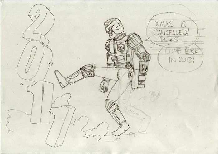
You'll see that I shifted his left leg a bit to bring his centre of balance back. I thought I was making the figure more dynamic but in retrospect I think it was a mistake - it was more interesting and anarchic as it was.
Alas.
I inked the drawing using a combination of fineline and brush pens, leaving the spot black areas to be filled later on the computer. I usually do this as it's faster but it also means I can change my mind later on and maybe hatch or something instead.
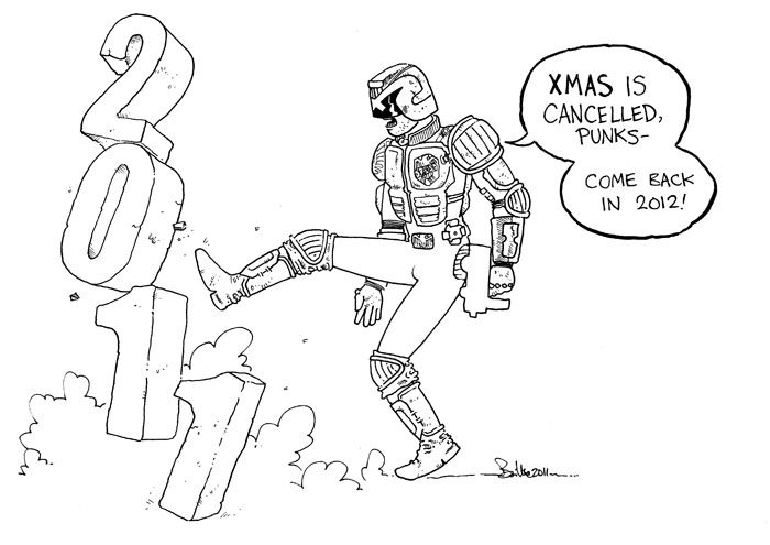
Then I scanned and plopped it in Photoshop.
After a few minutes of clean up (nothing too drastic) I laid down flat colours on a new layer beneath the inks. These colours can be anything you like and don't need to be anywhere near where you finally want to end up. Manga Studio has an automated - randomised colour - flatting process, but I haven't had a chance to explore that yet.
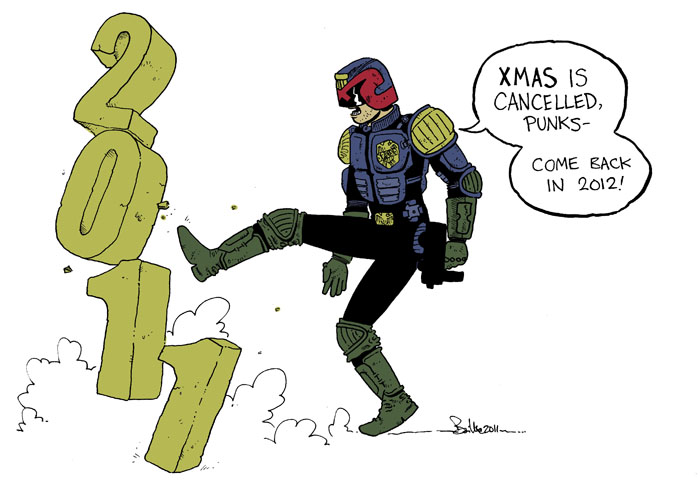
At this point I usually duplicate the flats layer, hide it (keeping it as a sort of 'save point') and start applying some shadows and gradients. I decided, because the figure doesn't actually take up a lot of the composition, that might make it too fussy - so I skipped that and went straight to some cell shading.

(Here I just created a new 'multiply' layer and, using the brush tool, painted some contour and drop shadows in a muted green-grey colour. I deliberately avoided being too neat with this.)

The side shadows on the 2, 0, 1 and 1 didn't work for me and I didn't want to go any darker, so I added benday dots.
(If you don't know how to do this play with the options under Filter->Pixelate->Colourhalftone)
I liked the dots so much I used them in the background too.
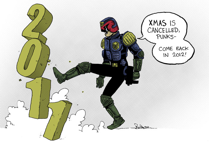
I liked the dots so much I used them in the background too.

Then I changed my mind and used a Photoshop-generated cloud pattern and some transparency sweeps to make a new one that balanced the drawing better.
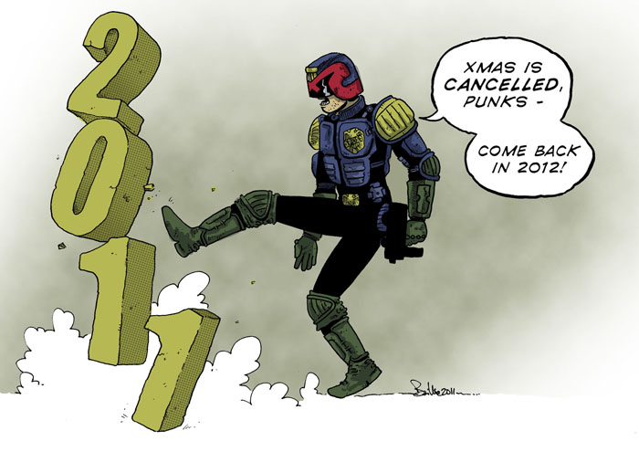
I also ditched my hand lettering, as it was slightly too sloppy. It would have been okay for dialogue but I should have been more careful with it at this scale. The font I used instead was courtesy of the excellent comicraft - picked up in their annual New Year's Day sale a few years ago.
In a few months' time I'm probably going to discover that this is nothing like what the movie uniform actually looks like. But, just like 2011, everyone will have forgotten by then.
Hmmm... I already think I should have made the body armour bulkier.
Anyway... I hope that was either interesting or useful.
Happy 2012!

No comments:
Post a Comment